 Surfaces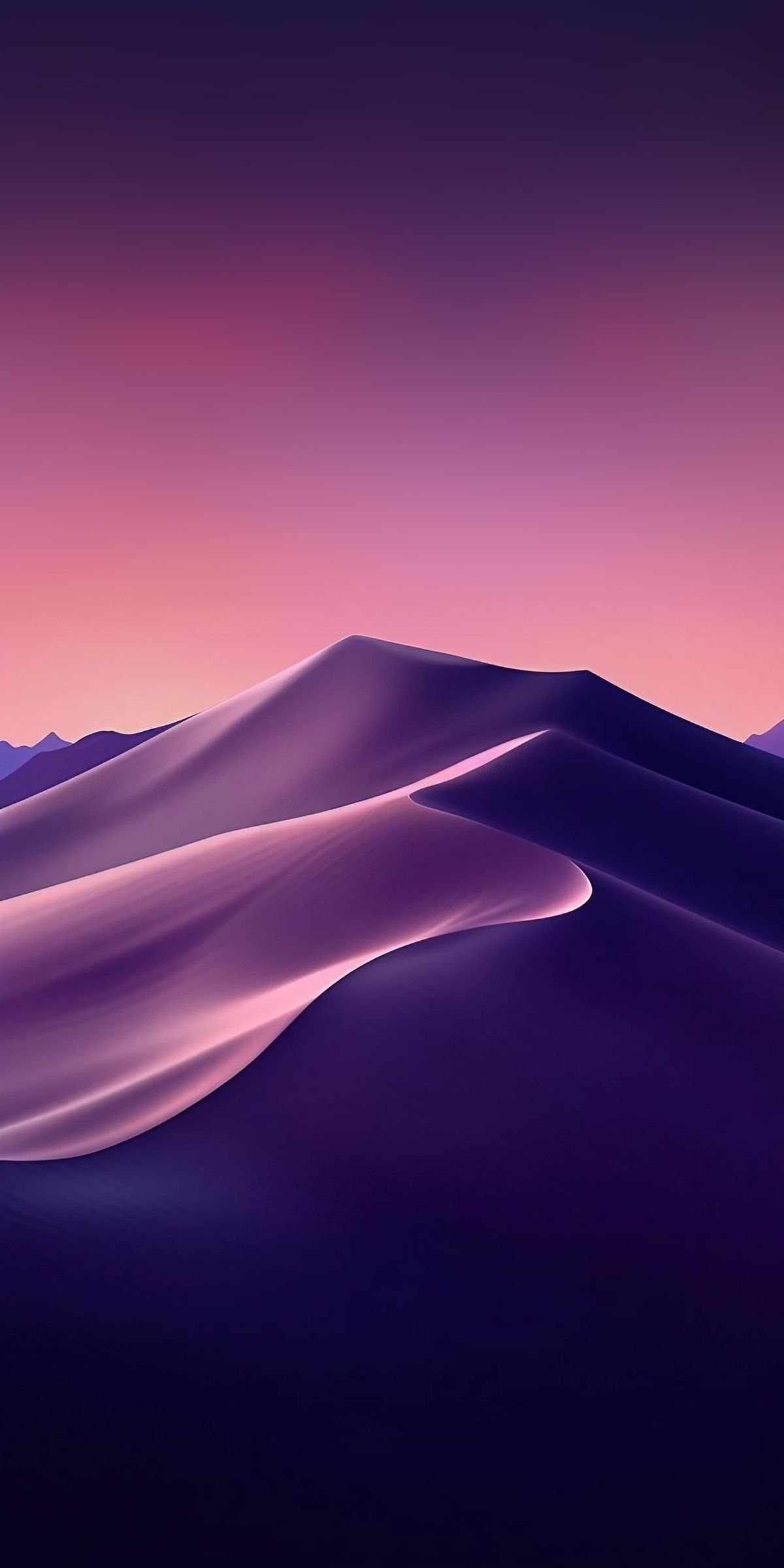
Look for open space
A quiet area in a composition can give app icons and desktop files room to stand out. Try the preview at your normal screen size before committing.
Match the format
Landscape artwork naturally fits a wide display. Portrait artwork fits a phone. Cropping can be beautiful, but check that your favourite part of the image stays in the frame.
Think about contrast
Light text needs a darker area behind it; dark icons need a lighter area. A wallpaper can have rich color without making every part of the screen busy.
Let the palette set the tone
Try a restrained palette for a calm workspace, or a strong accent for a little energy. Color filters in Surfaces make it easy to compare different directions.
Try a small collection
Keep a handful of favourites together in a playlist. It is a simple way to change the feel of your screen without starting your search from scratch.